Next Level Design
Creating a new aesthetic that looks fabulous on the wrist.
Design development of the Eco-Drive with Annual Accuracy of ± 5 Seconds Washi Paper Dial Models.
Citizen Watch Co., Ltd.
As a brand that believes in designs that are at once innovative and universal, The CITIZEN seeks to craft watches that people will want to wear regardless of transient changes in fashion. What sort of thinking and meticulous attention went into the design of the limited edition 30th Anniversary models from the Iconic Nature Collection? We spoke to Chief Planner Takayuki Ichikawa and Designer Sota Okumura who developed them together.
Watch the movie
It’s crucial not to impose too many
limitations on the design.
What does a product planner actually do?
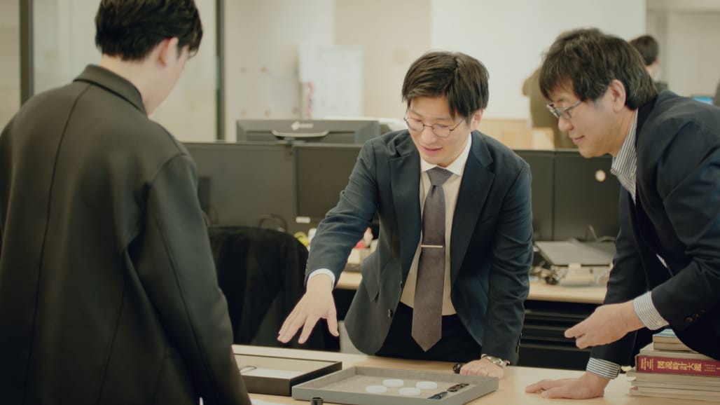
Ichikawa: It takes a lot of people to create a single watch model. Perhaps the easiest way to think of my job is that is that I’m the standard bearer or champion of the whole project. I’m in charge of managing what new models The CITIZEN should release, and with what sort of message, and then shepherding the whole development process along.
What position does design occupy in product planning?
Ichikawa: It’s fair to say that design is the most important thing. For me, design communicates our thinking to the customer; it shows them what our priorities are.
As a product planner, what’s your top priority?
Ichikawa: Not imposing too many limitations on the design is absolutely crucial. Of course, designers need to have a good grasp of the brand’s attitude and history, but it’s important not to let that choke off any creative thinking.
Even if the product planning department is basically respectful of the designers’ proposals, do you sometimes ask for modifications?
Ichikawa: Sure we do. The designer may have produced the most beautiful sketch, but if the watch won’t be sufficiently handsome as an actual physical product, then we’ll request modifications until we’re happy with it. The design sketch will be sent back and forth multiple times, and then there will be further discussions between the designer, the planner and the technicians even after the physical watch has been made. It’s like, you know, “The colour’s darker than I imagined. We’re going to have to change it.” That’s the reality of how watches get made. That was certainly true of this 30th anniversary project. I’m proud to say that these two models successfully express the philosophy of The CITIZEN brand precisely because of the intense two-way communication with the designer, and the focus on detail.
The CITIZEN is celebrating its 30th anniversary in 2025. What sort of planning went into the limited-edition anniversary models?
Ichikawa: The 30th anniversary was a good opportunity for us to reexamine the attitude of The CITIZEN as a brand. We reached the conclusion that a philosophy of “continuity and change” is absolutely fundamental to it. In other words, The CITIZEN is change-oriented while simultaneously respecting and valuing things that have been around for a long time. This project emerged from our desire to mark the milestone of the brand’s 30th anniversary by communicating that brand attitude in a powerful way.
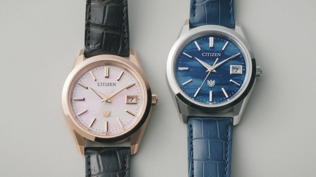
We designed the two limited edition Iconic Nature Collection models—the first models we have created for the 30th anniversary—based on the sense of beauty which has existed in Japan since ancient times. The specific aesthetic we chose as our theme is known as okashi, and is the subject of The Pillow Book, Japan’s first-ever essay miscellany.
Why did you choose okashi from all the various Japanese aesthetics out there?
Ichikawa: We had other options, including the sorrow-tinged awareness of impermanence known as mono no aware that’s the key sensibility in The Tale of Genji. But, rather like wabi-sabi which finds beauty in rustic simplicity and imperfection, mono no aware is ultimately about extracting something positive from fundamentally negative emotions. Okashi, the theme we selected, is different: It’s a more straightforward and optimistic aesthetic that simply sees the beautiful in beautiful things.
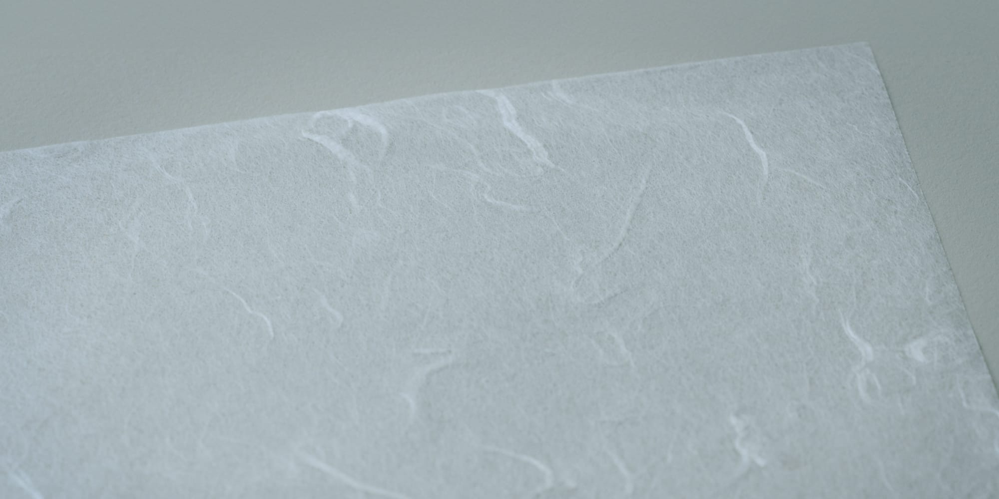
Effects from ink painting conjure scenes
suggestive of the passage of time.
Once okashi had been settled on as the theme, how did you set about the task of design?
Okumura: As I read and reread The Pillow Book, I realised that the passage of time and changing natural scenery are key to the okashi sensibility. Working from this insight, I tried to develop forms of expression that would suggest change and the flow of time.
One of the models which you created based on that insight is the one with the eye-catching pale pink dial. What’s the concept there?
Okumura: I was inspired by a famous passage from The Pillow Book about the dawn being most beautiful in spring, as the light creeps over the mountains, dyeing their outlines with a faint reddish tinge, while streaks of purplish cloud float above them.*
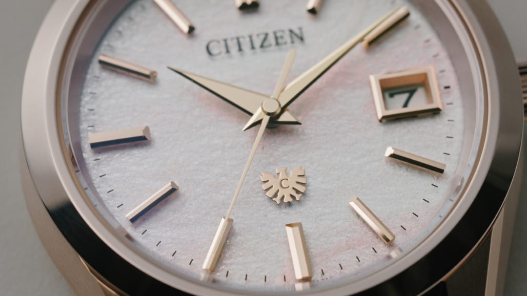
The motif of the model is “spring dawn.” The design evokes the morning clouds that appear just before the sun comes up.
Why did you opt for Tosa washi for the dial?
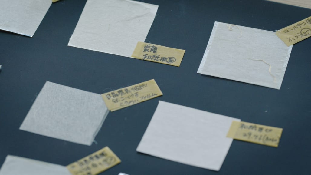
Our light-powered Eco-Drive models have a solar cell beneath the dial. As a result, they have an inbuilt design constraint because the dial must be able to let light through. Washi is used for several The CITIZEN models already. It’s a material that is light-permeable—overcoming that constraint—while also allowing for natural and beautiful forms of expression.
Given that the brand has a history of using washi, I felt that washi’s unique texture would be perfect to express the swirling clouds in this model. Among all the different types of Tosa washi, there’s one very distinctive variety known as Unryushi. It was perfect for the job. With a name that translates as “cloud-dragon paper,” Unryushi is remarkable for its long fibres whose shapes are reminiscent of clouds. So while the texture of the washi suggests the character of the clouds, I used traditional effects from ink painting to create a dial that evokes the dawning of a warm spring day, as suggested by that passage in The Pillow Book I mentioned earlier. The techniques we used were deliberate ink-bleeding (nijimi) and a light, dry brushstrokes effect (kasure). We achieved the final colour through the most meticulous efforts, adapting and refining the tone to evoke not just clouds but also cherry blossoms, the symbol of the arrival of spring.
Looking good isn’t enough.
What matters is, does it look
good on the wrist?
From your perspective as a product planner, what was appealing about a model with a “spring dawn” motif?
Ichikawa: I thought the idea of creating a beautiful effect by letting the ink bleed after it was printed directly onto the washi was awesome. It certainly wasn’t something that occurred to anyone on the product planning or technical side! It came about when Okumura said, “This is the form of expression I’m looking for, so why don’t we try this technique?” In that sense, this spring dawn model really made me conscious of the depth of Okumura’s creativity as a designer.
Okumura: Originally, I just wanted to make use of Unryushi’s long fibres and unique texture; it then occurred to me that we could do a better job of that if we printed directly onto the washi. Since this was the first time CITIZEN had ever tried doing that, we had to keep testing and validating as the process advanced. Because we believed that using this unprecedented technique would produce a model worthy of the 30th anniversary milestone, we all threw ourselves wholeheartedly into the challenge.
I heard that you made countless adjustments to the trial models.
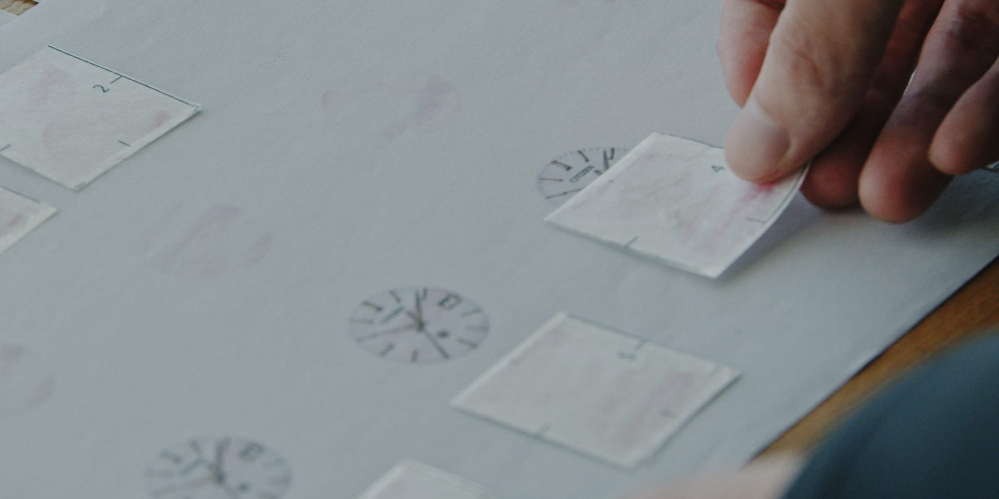
Okumura: That’s right. The first trial model we produced was of quite a deep pink. Although it was designed to evoke the clouds around a spring sunrise, it didn’t look quite right on the human wrist and Ichikawa complained that it didn’t feel sufficiently spring-like. I reread The Pillow Book yet again, wondering what I could do to make the design more evocative of the season, and I realised I’d be better off with a softer tone that gave off a palpable feel of the coming of spring. That change led to the final design which conveys a strong sense of the warmth of springtime.
Pink struck me as quite a bold colour choice for The CITIZEN.
Okumura: I couldn’t agree more. Still, as the 30th anniversary is a major milestone for the brand, being bold seemed like the right thing to do! To lift up the curtain on what went on backstage, various departments did in fact raise concerns. They were like, “Are you quite sure this is the right thing to do?” But from my perspective, I had to have pink to give proper visual expression to those lines from The Pillow Book about the dawn being most beautiful in the spring, so I was very committed.
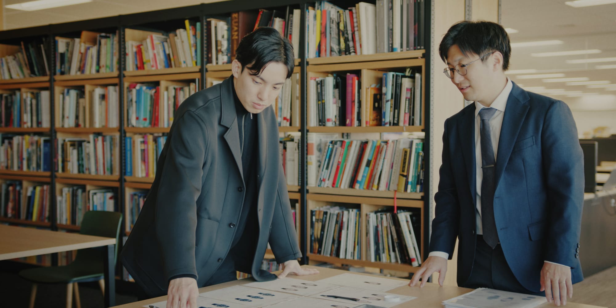
Turning something you have imagined into a physical object is extremely difficult, and the process of finetuning is also very time-consuming. I ended up asking the technical staff to produce a large number of prototypes.

I wanted to evoke an image
of a river that is really flowing.
Tell me about the other model, the one with the dial of such a strikingly deep blue.
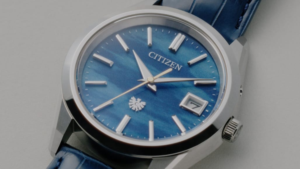
Okumura: This model is inspired by another passage from The Pillow Book. “In summer, I love the night. Not only when the moon is shining, but the dark nights too, when the fireflies cross each other's paths in their flight, or when the rain is falling”* So the design concept of this model is a scene from a summer night. It evokes the tranquil flow of a river with the moonlight reflected on its surface.
Did you use washi for this model’s dial too?
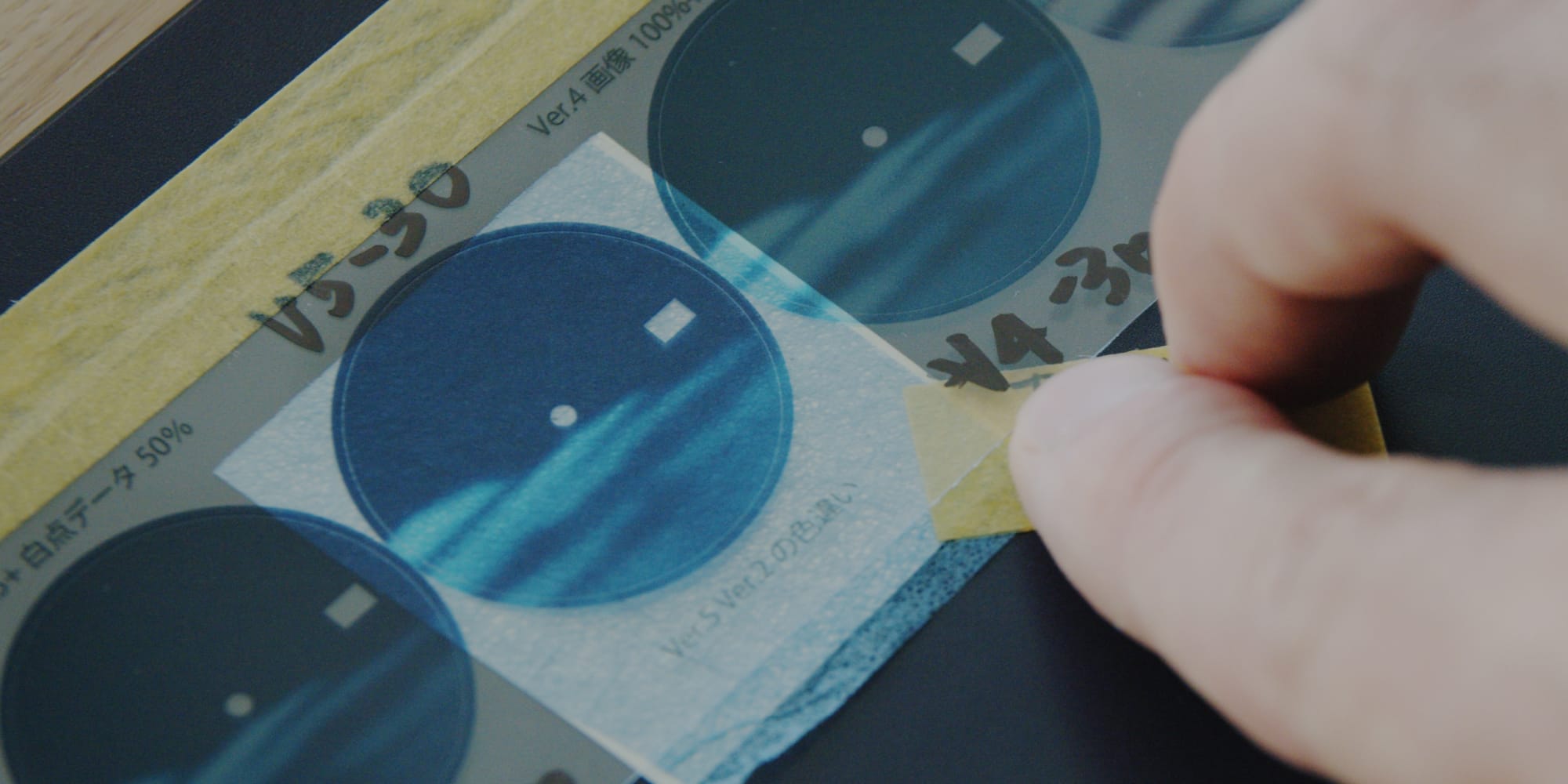
Okumura: We did, yes. We used indigo-dyed washi as the base and then applied ink-bleeding and dry brushstroke effects to the upper plate to evoke a gently flowing river, an image triggered in my mind by the moon and the fireflies that appear in The Pillow Book. The gold of the second hand suggests the trails of fireflies flitting to and fro.
As you said, the main river motif is not something that appears in The Pillow Book.
Okumura: No, it doesn’t, that’s right. When I read the passage in The Pillow Book and imagined the scene, the river was something that appeared spontaneously in my mind’s eye. The idea of a tranquil river resonated with Ichikawa when I mentioned it to him, so I felt that it was something that would connect with the users of the watch, and I ran with the idea.
How did you feel about the summer night model from the product planning perspective?
Ichikawa: This model uses two-piece construction. The dial actually consists of a circular upper plate layered on top of a disc of indigo-dyed washi to conjure the image of a gently flowing river. You couldn’t achieve the same effect with an image made from a single layer; moreover, the Japan Blue, which is hand-dyed using all-natural indigo, is not printed, giving it a different texture to the printing on the upper plate. For me, the most wonderful point of difference in this model is the way we successfully used mixed media to convey the volume and depth of the river.
Watchmaking takes you to a place
you cannot reach by yourself.
I would like to ask you both about your relationship with watchmaking. What part of your job do each of you like most?
Okumura: For me, the most appealing thing is the power a watch has to positively impact the mentality of the person wearing it. A watch is a very sensitive and delicate product. Change the design balance by even a millimetre and the whole thing looks and feels quite different. Having the opportunity to design products of this kind is immensely rewarding.
Ichikawa: The moment you succeed in creating an original watch—something that has never existed before—is just the best thing ever. And when customers like it, well, that’s the icing on the cake. Precisely because so many people are involved in making a watch, there are lots of interesting ideas forthcoming, meaning you can make a better product. That’s what I like.
Finally, what’s your message to people who have bought one of the Iconic Nature Collection 30th anniversary limited edition models?
Okumura: The designs enable people to access and enjoy the emotions inherent in vignettes of the changing seasons. I’ll be delighted if they feel a palpable sense of the season when they handle the watch.
Ichikawa: We spent a particularly long time developing these 30th anniversary limited edition models. They embody The CITIZEN’s worldview and they represent our take on the courtly ideal of beauty known as okashi through their use of nijimi and kasure. That’s the aesthetic I want people to be aware of when looking at the watches from a certain distance. Then, as they take a slightly closer look, they can start to enjoy all the little details we lavished attention on. Since a watch is also something you wear, we made countless prototypes to make sure that these models feel just right when you put them on. In conclusion, I want these watches to be a source of pleasure, whether people are looking at them from a certain distance or scrutinising them close up. I hope they will add a note of colour and brilliance to people’s lives.
Adapted from translations by Dr. T. A. Purcell and W. G. Ashton in Transactions of the Asiatic Society (1887-88)
About
The hand that makes the washi for the dial…
The hand that inspects the materials…
The hand that sketches the design…
The hand that assembles the watch…
Aspiring to be an integral part of your life.
In the pursuit of the next ideal in timekeeping,
The CITIZEN has a passion for making beautiful things.
The living embodiment of superior craftsmanship,
Our watches pass through a succession of skilled hands
Before reaching their ultimate destination:
the wrists of the wearers.
In Hand to Hand Story,
We highlight all the expert hands,
So dexterous, sensitive and thoughtful,
Required for the complex process of watchmaking.
